


6 cookie-banner design examples that fit the website
Your cookie banner is part of your visitors’ experience of the website. It should feel considered, readable and easy to use, without a separate design budget.
A good cookie-banner design gives people understandable choices, works on a small screen and leaves a clear route back to preferences. Each example below shows when the layout is useful, one design decision that matters and one thing to test on a phone or in the visitor journey.
The six layouts are original concepts drawn for this article. They are not screenshots of customer websites or tested conversion winners.
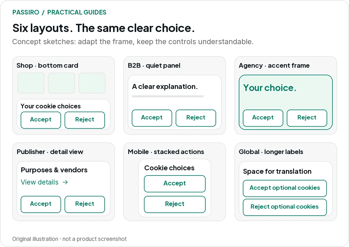
1. The independent shop: a compact bottom card
A white card with a thin border sits at the bottom of the screen, clearly separated from the page behind it. The explanation is short, and the main choices sit together.

- Useful when: product photography already carries the visual personality, and many visitors land directly on product pages.
- Design decision: place “Accept all” and “Reject all” side by side with the same size and style, and let them stack at equal width on mobile. Keep “Manage preferences” visible as a third choice.
- Test: on a real product page on a phone, check that the card does not cover “Add to basket”, the basket total or a chat button. With a keyboard, check that focus never disappears behind the card; the W3C guidance on obscured focus uses cookie banners as an example.
2. The B2B service site: a quiet full-width bar
A restrained bar along the bottom of the page uses the site’s neutral colours and one accent. Purposes are explained in the plain language you would use in a sales conversation.

- Useful when: visitors come to understand a service and then reach a contact or demo form, so the banner should not compete with the offer.
- Design decision: spend the space on clear purpose descriptions, such as what analytics measures and whether you use advertising, rather than on a large headline.
- Test: follow the lead journey on a phone, from landing page to submitted form. The headline and form button should stay reachable, and the form’s conversion tag should respect the choice made.
3. The creative agency: expressive frame, neutral choices
A colourful website can still have a calm consent interface. The personality goes into the card background, border or heading; the action labels stay plain.

- Useful when: the brand is bold, and a plain grey box would look out of place.
- Design decision: apply the brand colour to the frame, not to one button. Both main choices get the same treatment; our dark-pattern review covers the traps to avoid.
- Test: check every label on the brand background against the W3C contrast guidance, then view the banner on a phone over the busiest part of your homepage.
4. The publisher: room for detail without a wall of text
Publishers often work with many vendors and purposes. The first layer establishes the decision clearly; a details view carries the vendor and purpose information.

- Useful when: the site is funded by advertising, works with several ad partners or uses a framework such as IAB TCF.
- Design decision: keep the type readable and let the details view do its job, instead of shrinking a long vendor explanation into a small card. If you use IAB TCF, its required texts and controls shape the design, so confirm them before styling.
- Test: on a phone, open the details, find one vendor, change one purpose and save. Then reopen the settings and check that the change was kept.
5. The mobile-first business: stacked actions and visible focus
Design for the smallest screen you support first. Stack the actions at full width and give each one room.

- Useful when: most visitors arrive on phones, for example from social media campaigns or to book a local service.
- Design decision: make every choice a comfortable touch target, and keep the reject option as easy to reach as accept, without scrolling inside the banner. The W3C minimum target size is 24 by 24 CSS pixels; larger is easier to tap.
- Test: zoom in and turn the phone to landscape; all choices should stay reachable. Then complete the banner on a desktop using only the keyboard, and check that focus is always visible.
A clean mock-up is not an accessibility test. The working page, on real devices, is what needs checking.
6. The international site: a layout that survives translation
Short English labels can become much longer in another language. Leave flexible space instead of a narrow fixed width around the original text.

- Useful when: the site serves visitors in several languages, such as a shop that ships across Europe.
- Design decision: choose a layout where buttons can wrap or stack as labels grow, and translate the whole panel: purposes, settings, buttons and policy links.
- Test: preview each supported language on a phone with the browser set to that language. A translated headline above untranslated controls gives visitors an incomplete experience.
Language and geography solve different problems. A German-language visitor is not automatically in Germany, and a US visitor may prefer Spanish. Keep language selection separate from the regional consent setup.
A design review you can finish in one sitting
- Read every label on a phone without zooming.
- Compare the visibility of acceptance and rejection.
- Check text contrast on every button and background.
- Complete the preference journey using only the keyboard.
- Reopen settings after the banner closes.
- Check each supported language for missing or cut-off text.
- Confirm the site’s important controls remain usable.
Then ask someone who did not design the banner to explain what each choice means. That conversation often reveals more than another round of colour adjustments.
Two quick questions
Which layout gets the highest acceptance rate?
There is no universal winner. Audience, copy, placement and implementation all matter. Evaluate whether people can make an informed choice before treating a higher percentage as an improvement.
Can I customise a banner on Passiro Free?
Yes. The visual banner editor is included on every plan, including Free: choose a Modal, Banner, Box or Floating layout, edit the text and set your colours. Your own logo and removal of Passiro branding start with Pro. The banner design guide in the Support Center shows the steps.