


Dark patterns in cookie banners: 7 design choices worth fixing
Your cookie banner should make a decision easy. If saying no takes detective work, the design needs another look.
Dark patterns are interface choices that steer people towards a decision they might not otherwise make. In a cookie banner, that can mean hiding rejection, preselecting optional purposes or making the wording difficult to understand. A high acceptance rate does not tell you whether visitors understood the choice.
For teams serving European visitors, a useful reference is the EDPB Cookie Banner Taskforce report. It records the minimum positions that European data protection authorities agreed on when handling a series of cookie-banner complaints. National rules and guidance apply on top, so the same layout is not assessed identically in every country.
Each pattern below has a short problem and a concrete fix. The fixes are our practical recommendations; where a point comes from the law or from authority guidance, we say so.
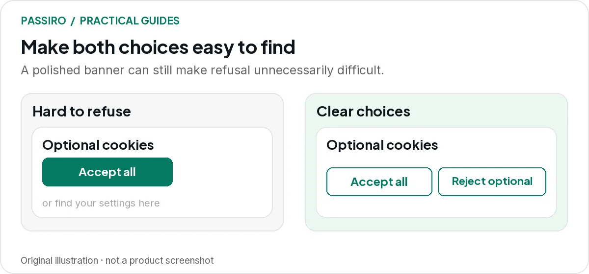
1. The reject option is there, but hard to see
A large “Accept all” button sits in the middle. The alternative is a faint link inside a paragraph. Visitors can technically refuse, but first they have to spot the option.
Problem: The refusal does not look like a choice. It is styled as body text, placed away from the buttons or tucked into the explanation, and on a phone it can disappear completely.
Fix: Make rejection a button next to “Accept all”, with the same size and shape. On mobile, stack both buttons at full width. A colleague should find the refusal on a phone without a hint.
The EDPB taskforce gave this as an example of a design that does not lead to valid consent: the only alternative to consent is a “refuse” link embedded in the text, without enough visual support to draw an average user’s attention to it.
In France, the CNIL ordered several website publishers in December 2024 to change banners where the reject option was a link embedded in the information or given far less emphasis than acceptance, because rejecting was not as easy as accepting.
This pattern is about visibility. Pattern 3 is about the number of steps: a reject option can be easy to see and still lead into a long settings journey.
2. Optional categories start switched on
A visitor opens preferences and finds marketing already enabled. Saving the screen could record a choice they never made.
Problem: Analytics or marketing toggles are on before the visitor touches them, so doing nothing looks like agreement.
Fix: Set every optional category to off by default where opt-in consent is required. Only strictly necessary storage stays on, marked as always active, with a one-line explanation beside each toggle.

Here the EU position is clear. GDPR Recital 32 says that pre-ticked boxes should not constitute consent, and the EDPB taskforce confirmed that pre-ticked opt-in boxes do not lead to valid consent.
3. Rejecting takes more steps than accepting
Count the clicks. If acceptance takes one, but refusal takes a settings panel, several toggles and a save button, the two routes are doing very different jobs.
Problem: The first layer offers “Accept all” and “Settings”, but no way to refuse. Rejecting means opening a second layer, switching categories off and confirming.
Fix: Put “Reject all” on the same layer as “Accept all”, so refusing takes one click, just like accepting. Keep “Manage preferences” as a third button for visitors who want a specific choice.

In the EDPB report, a vast majority of the participating authorities considered it an infringement when a layer with a consent button offers no option to refuse. A few authorities took a different view, because the ePrivacy Directive does not mention a reject option explicitly. Check the guidance of the authority that applies to your website.
4. Colour and contrast hide one choice
Brand colours are fine. Disappearing controls are not. A pale grey refusal label on white can be hard to read even when someone looks for it.
Problem: “Accept all” is a filled button in a strong brand colour, while the refusal is low-contrast text on a light background. One action is obvious; the other is easy to miss.
Fix: Give the main choices the same button style, or at least comparable visual weight and readable labels. Check each label against the W3C contrast guidance (4.5:1 for normal text) and make keyboard focus visible.

Authorities treat this as a case-by-case question. The EDPB taskforce agreed that no general colour or contrast standard can be imposed, but named one manifestly misleading example: a refusal button whose text contrast is so low that it is unreadable to virtually any user. The CNIL’s practical cookie recommendations also discuss misleading visual emphasis.
5. Vague wording hides the purpose
“Improve your experience” could mean remembering a language preference, measuring visits or building an advertising audience. Those are different activities.
Problem: The banner text uses broad phrases instead of naming what the optional cookies do, so visitors cannot tell what they are agreeing to.
Fix: Name each purpose in plain words, for example: “We use optional analytics cookies to understand which pages people visit.” Describe advertising in its own sentence, and mention only tools and purposes your website actually uses.

The EDPB taskforce agreed that a banner should make clear what it is about, the purpose of the consent and how to give it. A polished sentence that describes the wrong tools does not meet that aim.
6. Refusal comes with a guilt trip
“No thanks, I don’t want a better website” is not a useful consent label. It attaches an argument to a choice that should be understandable on its own.
Problem: The acceptance button sounds positive, while the refusal label uses guilt or sarcasm. The wording pressures visitors instead of describing the choice.
Fix: Use neutral, parallel button labels such as “Accept all”, “Reject all” and “Manage preferences”. Keep persuasive copy for the parts of your website where visitors expect to be persuaded.

7. Changing a choice is harder than making it
The banner disappears after acceptance. Now the visitor has to search your policy or contact support to withdraw.
Problem: After the first choice there is no visible way back to the settings, so withdrawing takes far more effort than accepting did.
Fix: Add a cookie-settings button that stays available on every page, or a clearly labelled link in a fixed place such as the footer, that reopens the same choices. Then test the result: after withdrawal, optional tags should stop.

GDPR Article 7(3) requires that withdrawing consent is as easy as giving it. The EDPB taskforce mentions a small, permanently visible icon or a link in a visible, standard place as examples, but no specific withdrawal design is mandatory; authorities assess the solution case by case.
A better review than “did acceptance go up?”
Ask someone outside the project to complete three tasks: reject optional cookies, allow analytics only and later withdraw that permission. Watch where they hesitate. Then run the technical Reject all test to check that the site follows their choices.
For layouts that keep the choices clear while changing the visual treatment, see six cookie-banner design examples.
Three quick questions
Can a cookie banner use our brand colours?
Yes. The practical question is whether visitors can still read, understand and use every option. Brand consistency should help people navigate.
Is a high consent rate evidence of a good banner?
Not on its own. Review the interface, the meaning of the choices and the resulting tag behaviour before drawing conclusions from acceptance numbers.
Are the design rules the same outside Europe?
No. In California, for example, many privacy choices are opt-outs rather than opt-ins, yet the regulations still require symmetry in choice. The CPPA’s enforcement advisory on dark patterns also notes that agreement obtained through dark patterns is not consent. See EU vs California cookie consent for the wider comparison.